
The difference between the two answers shows up the day something slips, and a Gantt chart is the cheapest way to see it in advance.
It is a horizontal bar chart: each row is a task, and the length of the bar represents its duration on an axis covering the time span of the work [4].
It applies to a professional coordinating two team members, a 15-person family business and a 100-person organization: the number of rows changes, not the question.
Italian data on public works shows that the time a job takes does not all sit inside its tasks: the gaps between one phase and the next account, at the median, for just under 40% of the total duration [2].
A Gantt chart is not there to show that a plan exists: it is there to make the duration, order and dependencies of the work visible, and it is worth as much as the dependencies someone has declared, not as much as the drawing is tidy.
Below: what it shows and what it doesn't, which columns come before the bars, the seven steps in a spreadsheet, a filled-in example and the mistakes that reduce it to a picture on the wall.
Duration, order and dependencies: what a Gantt chart shows
Do a plan written in an email and the same plan drawn as bars contain the same information?
Almost, except for one thing: the drawing forces you to state how long each thing takes and what cannot start before something else.
In the European Commission's project cycle management guidelines the tool appears as an activity schedule: a format for analyzing and graphically presenting a project's activities, which helps identify their logical sequence, expected duration and the dependencies between them, and provides the basis for allocating management responsibility [1].
The bars represent the sequence, duration and position in time of each task; they can overlap when two tasks run in parallel, and a vertical line marks the reference date [4].
The name comes from the American engineer Henry Laurence Gantt (1861–1919), to whom the chart is attributed [4]; in the Italian tradition of industrial organization it is recorded as a progress chart or Gantt chart, among the tools developed for scheduling and controlling operations [5].
The history lesson ends here, because the question of anyone looking for this tool is a different one: how do you build it?
It is more useful to set two boundaries, because these are the terms that actually get confused with this one.
A delivery schedule is a list of due dates: it says when something is expected, without stating how long the work that produces it takes or what that work depends on.
A flowchart represents the logical sequence of a recurring process, whereas a Gantt chart places in time a piece of work that has an end date: a process map describes how work gets done; the chart decides when.
It should also be said what the figure does not show on its own: the dependencies between tasks are not obvious, and the resources needed do not appear [4].
Anyone who needs to see the links and the critical path moves on to network scheduling, another family of tools described among the project management methodologies [4].
The columns that come before the bars in a Gantt chart
The bars are the result, not the work: a dependency column left empty turns the chart into a tidy drawing that won't survive the second week.
A list of forty micro-tasks or one of twelve grouped tasks: which one can you actually update on a Friday afternoon?
The Gantt template you need fits in six columns, and five of them are filled in before you color a single cell.
- Task — what gets done, with a verb and an object that the person doing the work will recognize.
- Duration — how many working days it takes, not on which date it happens.
- Depends on — the code of the task that must be started or finished first.
- Owner — a person, not a department.
- Milestone — the events that mark verifiable progress.
- Bars — the only column you draw, and the last one in time.
The level of detail is the decisive skill, and the most common mistake when preparing an activity schedule is breaking the work down into excessive detail [1].
The rule for when to stop is verifiable: you stop breaking things down when the level of detail is enough to estimate time and resources, and when the people doing the work have sufficient instructions on what they need to do [1].
For a job lasting a few weeks, this generally means ten to twenty-five rows, not eighty.
In the dependency column, two different questions are often treated as one: sequence asks in what order linked tasks should be carried out; dependency asks whether a task is tied to the start or completion of another [1].
There are also less visible dependencies, between otherwise unrelated tasks that fall to the same person and that this person cannot carry out at the same time [1]: where the business owner signs off quotes, oversees acceptance testing and negotiates with suppliers, these are the most frequent and the least written down.
The owner column is not an administrative detail: assigning a task means assigning responsibility for reaching the related milestones [1].
Milestones, in turn, are the key events that measure progress; the simplest are the estimated completion dates of the tasks [1].
That these columns must be cheap to maintain follows from how Italian companies are structured: 80.9% of those with at least three employees are controlled by an individual or a family, and in these companies an internal or external manager is brought in only in 1.4% of cases, falling to 0.8% among microenterprises [3].
In most cases, the person who maintains the chart is the same person who carries out one of the rows.
The steps to build a Gantt chart in a spreadsheet
Dedicated software or a blank spreadsheet: which one produces a readable chart first?
The second, in most cases, because the time goes into estimates and dependencies, not into the drawing.
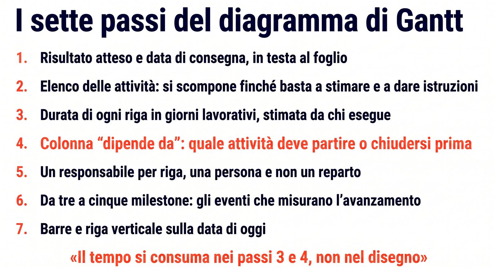
Here is how to make a Gantt chart in seven steps, in the order in which they hold together.
- Write the expected result and the delivery date at the top of the sheet, in the words in which the work was promised to whoever will receive it.
- List the main tasks, then break them down until the detail is enough to estimate time and resources and to give instructions to the people doing the work — and stop there [1].
- Estimate the duration of each row in working days, consulting those with the necessary technical knowledge or experience: estimates from people who don't do the work tend to be optimistic [1].
- Fill in the "depends on" column row by row, including dependencies that arise because two tasks fall to the same person [1].
- Assign an owner to each row, taking into account the skills and experience of the team members [1].
- Set three to five milestones, i.e., the events that tell you whether progress is on track [1].
- Draw the bars: the columns of the sheet become days or weeks, you color one cell for each period in which the task is active, and you keep a vertical line on today's date [4].
A Gantt chart template in a spreadsheet, stripped to the essentials, has these six columns: task, duration, depends on, owner, milestone, bars.
It also works on graph paper pinned up in the workshop: a wall that stays in view gets updated in front of whoever is there, while a file only gets opened if someone decides to open it.
A filled-in Gantt example for a customer job
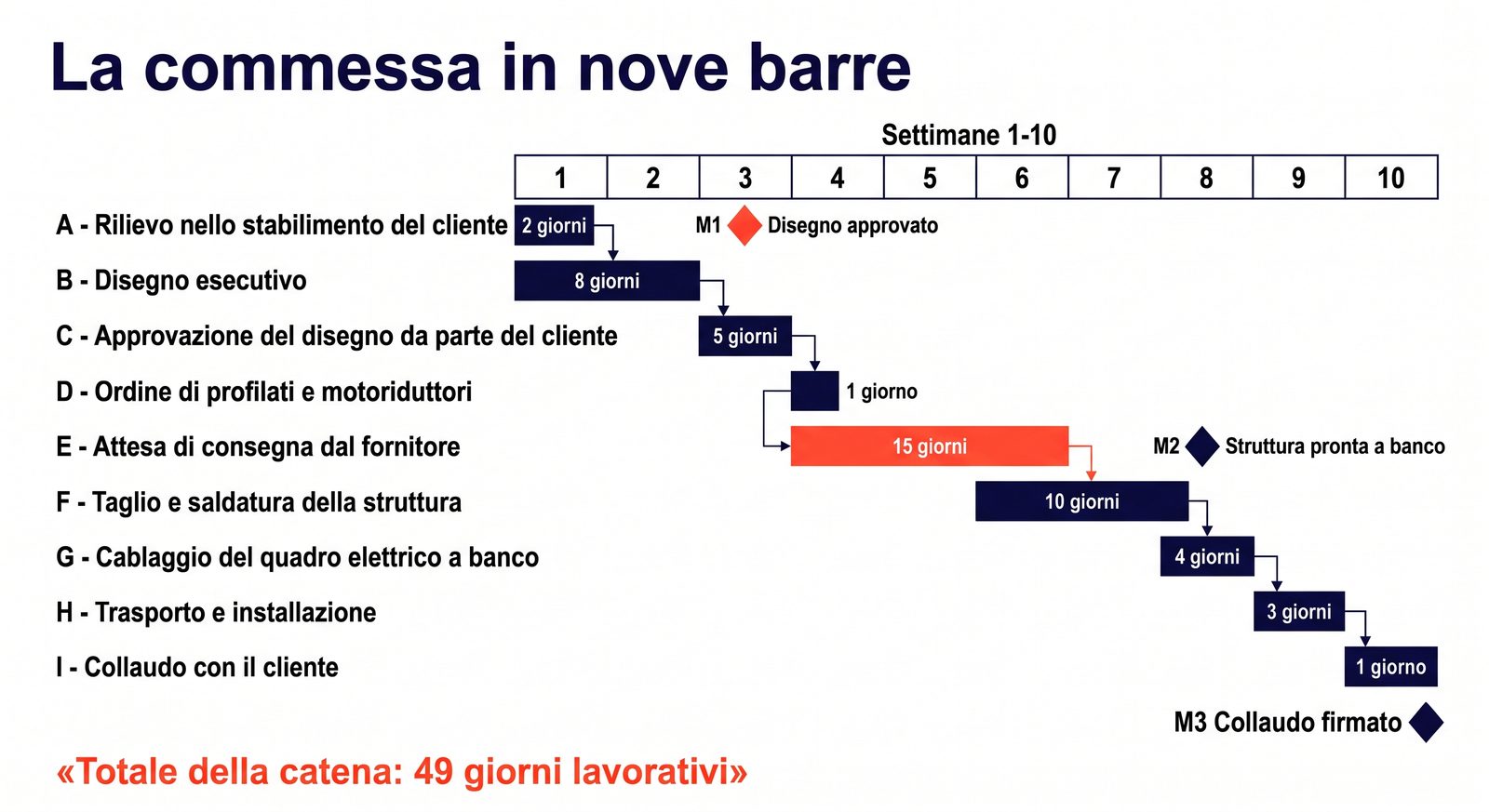
Eight weeks promised to the customer and nine tasks in a row: does the promise hold?
The chart doesn't answer for whoever decides, but it puts the answer in a column you can add up.
The case is hypothetical and built for this article: a family-run metal fabrication shop with eighteen employees that has to design, build and install an internal conveyor line for a local customer.
| Code | Task | Duration (working days) | Depends on | Owner |
|---|---|---|---|---|
| A | Site survey at the customer's plant | 2 | — | business owner |
| B | Detailed design drawing | 8 | A | engineering office |
| C | Customer approval of the drawing | 5 | B | business owner |
| D | Order of profiles and gear motors | 1 | C | purchasing |
| E | Waiting for supplier delivery | 15 | D | purchasing |
| F | Cutting and welding of the structure | 10 | E | shop supervisor |
| G | Bench wiring of the electrical panel | 4 | F | electrician |
| H | Transport and installation | 3 | G | shop supervisor |
| I | Acceptance testing with the customer | 1 | H | business owner |
Adding up the chain gives 49 working days, just under ten weeks: the promise was eight, and the gap shows up before you start rather than in the seventh week.
The longest bar is the wait for supplier delivery, 15 days out of 49: almost a third of the time is a gap in which the company is not working on the job, and it is the kind of time that a task list without durations doesn't show.
This is not a remote possibility: in Italy, more than one company in three with at least ten employees experienced supply difficulties or disruptions in 2021–2022, and almost half of these considered them temporary without adopting any strategy [3].
The milestones in this case are three: drawing approved at the end of week three, structure ready on the bench at the end of week eight, acceptance test signed in week ten.
There are four typical reasons why an estimate turns out too short, and it is worth checking them on your own sheet: essential tasks forgotten, interdependencies not sufficiently considered, competition between tasks assigned to the same person or the same machine, and the wish to make a good impression by promising short lead times [1].
Getting back within eight weeks requires two decisions, and the chart serves to show what they cost.
The first is to order materials right after the site survey instead of after the drawing is approved, moving fifteen days of waiting in parallel with design: it saves two weeks and puts the materials at risk if the customer asks for a change.
The second is to wire the electrical panel while the structure is being welded, removing the dependency between the two rows: it saves four days and ties up two people in the same period.
In a professional services firm the table has nine different rows and the same shape, and the longest row is often the wait for a document or a signature that depends on someone else.
The mistakes that turn a Gantt chart into a picture on the wall
A chart printed in January and still on the bulletin board in March: what has it changed on the shop floor?
The four mistakes below are not about the drawing; they are about the columns that come before it and how often someone touches them.
Tasks too fine or too coarse. Breaking down the work more than necessary is the most common mistake when preparing an activity schedule [1], and it produces a sheet that never gets updated because keeping it in order costs more than the work it describes.
At the opposite extreme, a single six-week row called "production" won't let you notice a delay while it can still be recovered.
No dependencies declared. Bars side by side look independent, and the figure alone does not make the links between tasks obvious [4]: the "depends on" column exists to make up for this limitation.
If it is empty on half the rows, the plan has not been thought through; it has been drawn.
Updated the first week and then left alone. The durations in the first chart are preliminary estimates, meant to be revised when work starts and then reviewed during execution in light of how it is actually going [1].
The habit that keeps the document alive is a fixed fifteen-minute slot on the same day each week: move the vertical line to today, close the completed rows, record what has slipped and look at what it drags along with it.
Used to monitor people instead of the work. The owner column answers the question "who do I ask where we are," and the responsibility that comes with it concerns reaching the milestones [1]: using it to measure who is slow produces inflated estimates at the next meeting.
More generally, a critical assessment published in a project management journal — of which only the abstract was read, because the full text is not freely accessible — places the tool's origins at the heart of scientific management, observes that it is applied with very few adaptations to projects of very different kinds and that it rests on principles that do not hold for every project, and calls for a reflective, context-aware use rather than a prescriptive one [6].
It remains to say when this tool is not useful.
It is not useful for the day-to-day flow of a department or a professional firm, which has no end date: there the question is not when but in what order, and that is a matter of priority management.
It is not useful for jobs with fewer than five tasks and only one person involved, where a list with two dates does the same job at a lower cost.
And it is not useful where the order of tasks inherently changes every week: there the plan is redone on short horizons of one or two weeks, instead of being updated on a horizon that no longer describes the work.
Limits and conditions of applicability
The chart represents the tasks someone has listed: whatever is left off the list has no bar, no duration and does not enter the total.
The Bank of Italy data on public works timelines [2] concern Italian projects monitored under cohesion policies, with their own administrative procedures: they show how much the gaps between phases can weigh, but they do not measure the same share inside a private company.
The metal fabrication case is hypothetical and built for this article: the figures are there to make the procedure visible, not to estimate the duration of a real job.
The critical assessment cited in [6] was read in the abstract published on the institutional portal of one of the authors' university, not in the full text of the article, which is available only for a fee: this article attributes to it only what the abstract states, and not the editorial observations on the use of the owner column.
When the delivery date is bound by a contractual commitment or a regulatory deadline, the chart flags the gap but does not resolve it: the choice goes back to being one among scope, cost and time.
FAQ
What is a Gantt chart and what is it used for?
It is a horizontal bar chart in which each row is a task and the length of the bar represents its duration along a time axis [4].
It is used to make the duration of tasks, their order and the dependencies between them visible in a single figure, and to establish who is accountable for what [1].
It doesn't explain why a job is late: it shows which other tasks that delay drags along with it.
How do you make a Gantt chart in a spreadsheet?
You fill in five columns — task, duration in working days, dependency, owner, milestone — and only at the end do you color the cells corresponding to the periods of activity, with a vertical line on the reference date [4].
The time goes into duration estimates and dependencies, not into the drawing.
What is the difference between a delivery schedule and a Gantt chart?
A delivery schedule is a list of due dates: it says when something is expected, without stating what it depends on.
The chart adds the two pieces of information that make the plan usable when something slips: the duration of each task and its link to those that come before it [1].
How often should a Gantt chart be updated?
The initial durations are preliminary estimates to be revised when work starts and then during execution, in light of actual progress [1].
For a job lasting a few weeks, a weekly update is enough, as long as it happens on a set day and takes only a few minutes.
Do you need dedicated software to build one?
No: a spreadsheet with cell coloring is enough for a job of a few dozen rows, and a gridded wall in the workshop works better when the people doing the work don't open a file during the day.
The choice of tool matters less than the level of detail of the tasks and the quality of the declared dependencies [1].
Operational summary
The starting point is the expected result and the delivery date, written at the top of the sheet in the words in which the work was promised.
Tasks are listed and broken down to the point where the detail is enough to estimate time and resources and to give instructions to the people doing the work, and you stop there.
The duration of each row is asked of whoever will carry it out, in working days, because estimates from people who don't do the work tend to be optimistic.
The "depends on" column makes the difference between a plan and a drawing: fill it in row by row, including dependencies that arise because two tasks fall to the same person.
Each row is assigned an owner, and three to five events become verifiable milestones.
Only at this point do you color the bars, with a vertical line on today's date.
Adding up the chain tells you whether the promise made to the customer holds, and if it doesn't, you decide what to compress knowing what it costs.
The last item on the agenda is the weekly update slot, because a chart that stands still stops describing the work within a few days.
Conclusion
A Gantt chart is not proof that a plan exists: it is the document that makes the duration, order and dependencies of the work visible, and it is worth as much as the dependencies someone had the patience to declare.
The bars are the last thing you draw and the first thing you look at, and this inversion explains why so many tidy charts don't survive the second week: the value lies in the five columns that come before them and in the weekly fifteen minutes that keep them updated.
If you want to place the tool in a broader framework, you will find it in the guide to project management, while the comparison between planning approaches is described in the project management methodologies; for work that has no end date and calls for an order rather than a calendar, see weekly planning.
After a few jobs planned this way, the meeting with the customer changes in content.
No longer a date promised on gut feeling and then defended, but a short table that shows where the time goes and which two decisions would bring it back in line.
It is the shift from a company that discovers delays once they have already happened to one that sees them a few weeks in advance, and the weeks gained in advance are the only ones you can still use.
Sources and references
[1] European Commission – EuropeAid Cooperation Office, "Aid Delivery Methods — Volume 1: Project Cycle Management Guidelines", March 2004, §5.4 "Activity, resource and cost schedules", pp. 85-87. Available at: https://international-partnerships.ec.europa.eu/document/download/f7ed20c4-5fc2-4ed7-b54c-0805e4ed952d_en?filename=methodology-aid-delivery-methods-project-cycle-management-200403_en.pdf
[2] Carlucci, C., Giorgiantonio, C., Orlando, T., "Tempi di realizzazione delle opere pubbliche e loro determinanti", Banca d'Italia, Questioni di Economia e Finanza (Occasional Papers) no. 538, December 2019 (population of 55,932 projects from the 2000-2006 and 2007-2013 programming cycles, active monitoring as of December 31, 2017). Available at: https://www.bancaditalia.it/pubblicazioni/qef/2019-0538/QEF_538_19.pdf
[3] ISTAT, "Censimento permanente delle imprese 2023: primi risultati", press release, November 14, 2023 (reference year 2022; sample of about 280,000 companies with at least 3 employees, representative of 1,021,618 units). Available at: https://www.istat.it/comunicato-stampa/censimento-permanente-delle-imprese-2023-primi-risultati/ — PDF: https://www.istat.it/wp-content/uploads/2023/11/REPORTCensimprese.pdf
[4] Raimondi, M., "Project management — Gli strumenti: Gantt, PERT/CPM", course material for course Y71020, Università Carlo Cattaneo – LIUC, School of Engineering, 2007. Available at: https://my.liuc.it/MatSup/2007/Y71020/DM%20-%2010%20project%20management%20-%20gantt&pert-cpm.pdf
[5] Ronchi, L., entry "Organizzazione industriale", Enciclopedia Italiana – IV Appendice, Istituto della Enciclopedia Italiana (Treccani), 1979. Available at: https://www.treccani.it/enciclopedia/organizzazione-industriale_res-c2006e9d-87e9-11dc-8e9d-0016357eee51_(Enciclopedia-Italiana)/
[6] Geraldi, J., Lechter, T., "Gantt Charts Revisited: A Critical Analysis of its Roots and Implications to the Management of Projects Today", International Journal of Managing Projects in Business, vol. 5, no. 4, 2012, pp. 578-594, DOI 10.1108/17538371211268889. Abstract consulted on the institutional portal of Copenhagen Business School: https://research.cbs.dk/en/publications/gantt-charts-revisited-a-critical-analysis-of-its-roots-and-impli/