
The difference between those two answers can be measured, and the Pareto chart is the cheapest way to measure it.
It's a bar chart that sorts events that have already happened and been counted in decreasing order of importance, with a line of cumulative percentages showing how few items account for most of the total [1].
It works for a professional with two team members, for a fifteen-person family business and for an organization of a hundred: what changes is the record you start from, not the question.
Asymmetry, after all, is the rule in the Italian economy: companies with at least three employees make up 22.5% of the total and produce 85.1% of national value added [3].
The Pareto chart doesn't tell you what causes a problem: it tells you which problem to start with, and it's only as good as the criterion used to count and weight the columns, not the shape of the curve.
What follows: the five names in the family, how to check the 80/20 against your own numbers, the five construction steps with a worked example, the move to causes, and the mistakes that empty the chart of meaning.
Five names for one thing: what the Pareto chart really does
Pareto principle, Pareto's law, 80/20 rule, Pareto analysis, Pareto chart: five labels for a single idea, or five different tools?
They belong to the same family, and telling them apart matters because only the last one can be drawn on a sheet of paper.
Pareto's law in the strict sense is the income law of economist Vilfredo Pareto: the diagram plotting the number of income earners against the amount of income would tend toward a straight line, with a slope that stays similar over time [2].
The Treccani encyclopedia notes that this law has not been confirmed empirically, although it remains relevant as a matter of method [2].
The Pareto principle, by contrast, is a later generalization due to Juran, who observed that quality losses are not distributed evenly across a product's characteristics but are concentrated in a small share of them [1].
The 80/20 rule is the memorable form of that principle, and the two fractions are arbitrary: other values would describe the same asymmetry with the same accuracy [1].
Pareto analysis is the procedure that sorts counted events in decreasing order of importance.
The Pareto chart is its visual representation: bars sorted by decreasing frequency, with the cumulative percentage line that Juran added to make the asymmetry readable [1].
In Italian quality-control textbooks, the same object appears as the ABC curve, when cumulative frequencies are used to separate occurrences into three classes of relevance [5].
The chart lives where problems have already happened and someone has counted them: it doesn't generate hypotheses about causes, it ranks them by weight.
That is also the boundary with the techniques that come afterward: the chart chooses the problem to work on, it doesn't look for its cause, and the move to analysis techniques is described further on.
It should also be kept distinct from ordering the activities on your to-do list, which follows different criteria and is the subject of priority management.
How much the 80/20 is really worth: checking the Pareto principle against your own numbers
The chart is only as good as the criterion used to count the columns, not the shape of the curve: asymmetry is measured on your own records, not assumed because you read about it somewhere else.
Two companies with the same number of machine stoppages, one with ninety percent of lost hours due to two causes and the other with the hours spread across nine: does the same principle apply to both in the same way?
No, and the difference only shows when you count.
The asymmetry between a few elements that weigh a lot and many that count for little is documented at the national level.
Italian companies with at least three employees make up 22.5% of the total and produce 85.1% of national value added, according to ISTAT's permanent census of enterprises, with 2022 as the reference year [3].
In Italian foreign trade the concentration is even tighter: in 2025, 78.3% of export sales were made by 5,831 operators out of 126,491, while micro-exporters, the largest segment, contributed 0.2% [4].
These numbers describe an economy, not a workshop: they're a reason to go and count, not a prediction of how concentrated a specific problem is.
Caution is needed with the chart itself, too.
Sorting by decreasing frequency, which is what makes a Pareto chart recognizable, produces a downward slope even on random data: the shape goes down anyway, because it has been sorted [1].
It follows that a steep curve does not, by itself, prove real concentration.
Two counts make this verifiable without statistics.
- how many categories it takes to reach 80% of the total: if two out of nine are enough, the concentration is clear; if it takes seven, the curve is almost flat and the order of intervention has to be decided using other criteria;
- whether the same list, counted over the previous period, puts the same categories at the top: an order that changes with every count is measuring noise.
A family workshop that has been logging stoppages for a month has few events and an unstable order: the chart becomes reliable when the record covers a full work cycle.
From record to chart: the five steps of Pareto analysis
Do a new form to be filled in for six months and a record that has existed for two years lead to the same chart?
The second gets there first, and almost every company has one: work reports, delivery notes, service requests, inspection reports, non-productive hours noted on the board.
The procedure takes five steps, and the first two determine the quality of the other three.
- Set the unit of count and the period: one event is one row, and the period is stated at the top of the sheet and covers at least one complete work cycle.
- Define the categories: five to ten, mutually exclusive, written in the words of the people who fill in the record, with an "other" item that stays last and never the highest.
- Count, and next to the count note the weight: hours lost, parts to redo, cost of materials, when the items don't all cost the same.
- Sort the columns in decreasing order of value and calculate the cumulative percentages row by row: the sorting is what makes the chart readable, and it's also what has to be handled with caution [1].
- Read where the cumulative line crosses 80%: the items to the left of that point are the candidates; those to the right stay on record and don't become this week's work.
The cumulative curve sorts the items into three bands of relevance — in Italian quality-control textbooks it's the ABC curve — and band A is the starting point [5].
The chart takes ten minutes with a spreadsheet, or can be drawn by hand on graph paper: the value isn't in the chart but in the two columns that come before it, category and weight.
The minimum sheet is what this series calls the Pareto chart tally template: category, count, weight, percentage of total, cumulative percentage, period.

A worked Pareto chart example: counting events or weighting them
Is the cause that shows up most often the same as the cause that costs the most?
Rarely, and a chart that only sorts counts sends the team to the wrong problem with a clear conscience.
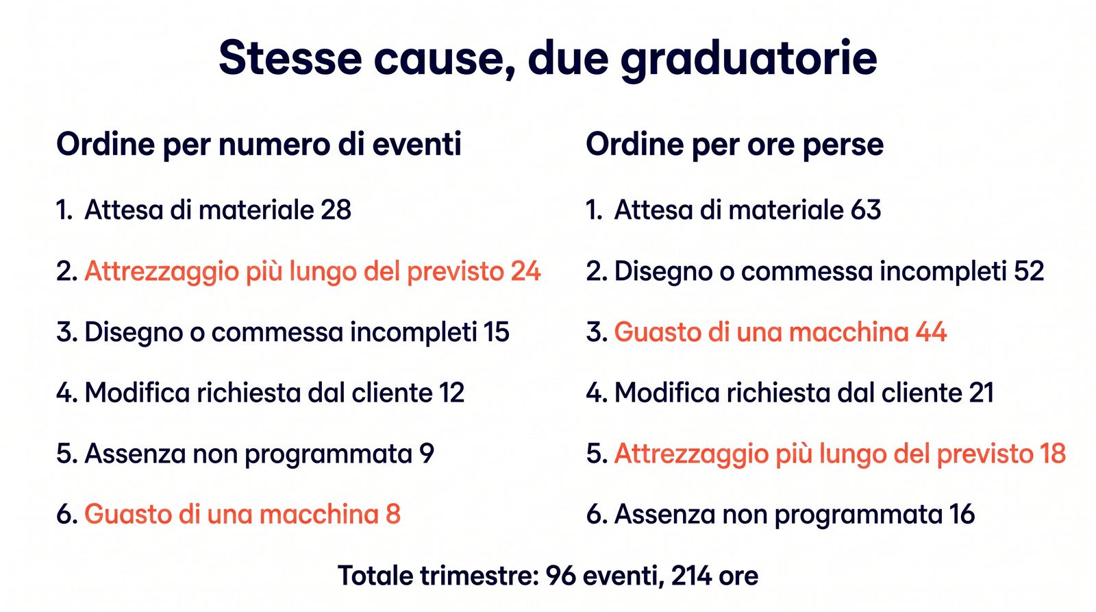
The case is hypothetical and built for this article: a twenty-person family workshop doing contract work for other manufacturers, one quarter's record of stoppages, 96 events and 214 non-productive hours.
The table shows the same six categories counted twice, by number of events and by hours lost.
| Cause of stoppage | Events | Hours lost | % of hours | Cumulative % of hours |
|---|---|---|---|---|
| Waiting for material from the supplier | 28 | 63 | 29.4% | 29.4% |
| Incomplete drawing or job order | 15 | 52 | 24.3% | 53.7% |
| Machine breakdown | 8 | 44 | 20.6% | 74.3% |
| Change requested by the customer after work started | 12 | 21 | 9.8% | 84.1% |
| Setup longer than planned | 24 | 18 | 8.4% | 92.5% |
| Unplanned absence | 9 | 16 | 7.5% | 100% |
Sorted by number of events, setup is the second item and machine breakdown is the last.
Sorted by hours lost, setup drops to fifth place and breakdown rises to third: twenty-four short stoppages weigh less than eight long ones.
The top three items by hours cover 74.3% of the total, the top four 84.1%: the 80% threshold falls inside the fourth column, and the chart doesn't decide for the reader where to draw the line.
The two readings don't contradict each other; they answer different questions: the first says what happens most often, the second what costs the most.
To decide what to work on this week, the second one counts, unless frequency has a hidden cost that the record doesn't capture, such as the time spent rescheduling production.
In a professional firm, the same table counts redone files and reworked hours, with the same two rankings and the same gap.
Once you've found the first column: from the Pareto chart to root cause analysis
Have a meeting that ends with "let's start with waiting for material" and one that ends with an analysis template opened on those waits produced the same result?
The first has chosen a target, the second has started working on it: the chart closes the finding phase and doesn't, by itself, open the understanding phase.
The tallest column is a measured effect, not a cause: "waiting for material" describes what happens, and the reasons why it happens still have to be found.
The transition has three minimum requirements.
- the chosen item is stated as a problem with a number and a period, not as a generic category: sixty-three hours lost in one quarter waiting for material;
- the analysis technique is declared before anyone is called in, and it depends on how many plausible answers exist to the first "why";
- the date of the recount is set together with the intervention, using the same categories and a period of the same length.
The first requirement has a form of its own, the one described in how to write a problem statement: the column becomes a line that says what happens, where, since when and how much it costs.
When there are many plausible answers coming from different departments, the hypothesis is opened up in breadth with the Ishikawa diagram.
When the chain is plausibly linear, you dig in depth with the 5 whys technique.
When the problem is serious or cuts across several functions, the complete framework is root cause analysis, and the process in which all of this sits is described in the guide to business problem solving.
If the chosen item concerns products or services that don't meet requirements, the record to start from and the actions to track are those of nonconformance management.
The second chart, built after the intervention on the same categories, is the check: if the column goes down and the others stay put, the intervention worked where it was supposed to.
If it goes down and all the others go up together, what changed is the way things are recorded, not the work.
The mistakes that turn a Pareto chart into a picture that doesn't drive decisions
A chart pinned to the board for six months and one redone every quarter with the same categories: which of the two has changed anything in the department?
The four mistakes below aren't about the drawing; they're about the two columns that come before it, which is why you spot them by looking at the record, not the chart.
Counting what's already written down and stopping there. The chart represents the events someone has noted, and problems that stay out of the record show up in the chart with a height of zero.
The corrective step is to ask the people who see the work go by what happens that doesn't end up in the record — the method for looking for problems before they count themselves is problem finding, and the place where reports are stored in accountable form is the problem log.
Overlapping categories. If "supplier delay" and "waiting for material" coexist in the same list, the counts are split between two columns and neither reaches the top.
The corrective step is to rewrite the list with the people who fill in the record, checking that each event can fit into only one item and that "other" stays below ten percent of the total.
Sorting by frequency when the items don't cost the same. This is the gap already seen in the table: weighting the columns by hours, parts or money changes the ranking, and therefore the decision.
Reading the downward slope as proof. This is the point already made: the curve goes down even when the data are random, because it has been sorted.
The corrective step is to look at the number of observations before the slope and, with few events, to postpone the decision by one count rather than drawing it from a steep chart [1].
The final check is a matter of reading: if the first column stays the same when you change the counting criterion and the period, it's a target; if it changes every time, it's well-sorted noise.
Limits and conditions of applicability
The chart represents the events someone has recorded: whatever doesn't make it into the record doesn't appear in the chart and carries no weight.
The ISTAT and ISTAT-ICE data cited describe the distribution of the Italian economy [3] [4]: they show how common asymmetry is, but they don't prove causal links or the internal distribution within a single company.
Sorting by decreasing frequency produces a downward slope even on random data, so the steepness of the curve is not in itself proof of concentration [1].
The workshop case is hypothetical and built for this article: the figures serve to show the procedure, not to estimate a result.
When an event is rare but has serious consequences — workplace safety, contractual or regulatory obligations — ranking by frequency or cost is not the selection criterion, and the intervention doesn't wait for the next count.
FAQ
What is the 80/20 rule, and does it apply to every company?
It's the shorthand form of the Pareto principle: a small share of causes produces most of the effects.
The two fractions are arbitrary, and other values would describe the same asymmetry with the same accuracy [1]: in a single company's data the ratio may turn out to be 70/30 or 90/10, and it has to be measured before it's used.
What's the difference between the Pareto principle, Pareto analysis and the Pareto chart?
The principle is the general observation about the uneven distribution of effects [1].
The analysis is the procedure that counts events and sorts them in decreasing order of importance; the chart is the resulting figure, with sorted bars and the cumulative percentage line.
How much data do you need for a Pareto chart to be reliable?
There's no universal threshold, and the practical criterion is stability: if the top items stay the same over two consecutive periods, the order is informative.
With few observations, it's better to postpone the decision to a later count, because the downward slope of the curve may be an effect of the sorting [1].
Do you need software to build one?
No: a spreadsheet and two columns, category and weight, are enough, plus the cumulative percentage calculated row by row.
The time should go into defining the categories and choosing the unit of measure, not into the chart.
Operational summary
The starting point is a record that already exists: work reports, delivery notes, service requests, inspection reports.
State the period, choose five to ten mutually exclusive categories written in the words of the people who fill in the record, and keep "other" below ten percent.
Next to the count of events, note the weight — hours, parts, money — because the most frequent item and the most expensive one rarely coincide.
Sort the columns in decreasing order of value and calculate the cumulative percentages, which show how many items it takes to reach 80% of the total.
Before deciding, check that the order is stable across two periods: an order that changes with every count is measuring noise.
State the chosen item as a problem with a number and a period, and from there begin the work on causes with the technique suited to the number of hypotheses in play.
The last line on the agenda is the date of the second count, on the same categories and over a period of the same length.
Conclusion
The Pareto chart isn't a chart that explains a problem: it's the count that tells you which problem to start with, and it's only as good as the criterion used to count and weight the columns.
The five names that lead here — principle, law, 80/20 rule, analysis, chart — point to a single idea and a single object you can draw, which works on events that have already happened and been recorded.
The tallest column remains an effect: that's where the work on causes begins, with the Ishikawa diagram when there are many hypotheses and the 5 whys technique when the chain is linear.
If you want the map of the process in which all of this sits first, you'll find it in the guide to business problem solving.
After a few quarters of repeated counts on the same categories, the Monday meeting changes its subject.
No longer the list of what went wrong, but a short table with two columns and a decision: this week we work on this item, and in three months we check whether it has gone down.
It's the shift from a company that reacts to ten problems at once to one that tackles them one at a time with the count in hand, and the hours no longer lost become available again for the work people have chosen to do.
Sources and references
[1] Wilkinson, L., "Revising the Pareto Chart", The American Statistician, vol. 60, no. 4, November 2006, pp. 332-334, DOI 10.1198/000313006X152243. Author's copy available at: https://www.cs.uic.edu/~wilkinson/Publications/pareto.pdf (accessed via the archived copy: https://web.archive.org/web/20231222193314/https://www.cs.uic.edu/~wilkinson/Publications/pareto.pdf)
[2] Treccani, "Paréto, Vilfredo, marchese", Enciclopedia on line, Istituto della Enciclopedia Italiana. Available at: https://www.treccani.it/enciclopedia/pareto-vilfredo-marchese/
[3] ISTAT, "Censimento permanente delle imprese 2023: primi risultati", press release, November 14, 2023 (reference year 2022; about 280,000 responding companies, representative of 1,021,618 companies with at least 3 employees). Available at: https://www.istat.it/comunicato-stampa/censimento-permanente-delle-imprese-2023-primi-risultati/ — PDF: https://www.istat.it/it/files/2023/11/REPORTCensimprese.pdf
[4] ISTAT – ICE Agenzia, "Commercio estero e attività internazionali delle imprese — Annuario 2026", press note, July 16, 2026 (2025 data). Available at: https://www.istat.it/comunicato-stampa/comunicato-stampa-annuario-statistico-istat-ice-2026/ — PDF: https://www.istat.it/wp-content/uploads/2026/07/NOTA-STAMPA_ISTAT-ICE_2026.pdf
[5] Università Carlo Cattaneo – LIUC, "Controllo di qualità — Strumenti per il controllo della qualità e la sua gestione", chapter 10 of the teaching materials for course Y71006, 2006. Available at: https://my.liuc.it/MatSup/2006/Y71006/CAPITOLO%2010.pdf